On a daily or weekly basis, an ISO’s load is determined by many things. An excellent correlator to the day-to-day variation is temperature variation. There are other factors that contribute. Loads change over the week and seasons, for example. Holidays have an effect. You get the idea.
Underlying the daily changes is load growth or decline. The Northeast, for instance, has seen significant load declines the past few years. ERCOT, however, is seeing continued growth. This can be seen in the plot average weekly load for the past few years.
Plotting the data for the past couple of years, we can see the year-to-year difference. For instance, winter storm Uri’s effect is pretty clear in the plot as the spike in early February (blue line).
Loads recently however have not been near records, but the temperatures have been cooler than the past few years this year, so is the lack of obvious growth the result of the temperature or from lackluster economic activity?
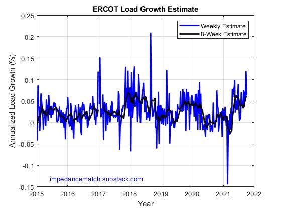
We attempt to take out the temperature effect and compare weekly values from the prior year to the current year. When a linear temperature difference correction is removed, the following plot can be generated showing primarily the annualized load growth. The blue line shows weekly differences (in percent) from the same week during the prior year. The black line is an 8-month average.
Here are some takeaways:
Load growth stopped near April, 2020
Load growth resumed at a minimal rate in Fall, 2020.
Load growth this year (post-Uri) has been about 5%


